As well s the forms and conventions of the genre, I also looked into the codes and conventions of trailers themselves. All trailers contain the same conventions all through.
http://miguelpilgrima2media.blogspot.co.uk/2012/03/i-have-watched-trailer-for-upcoming.html
Above is a bit of research I have done on an existing film trailer for the Film 'War Horse'.
Music
All film trailers contain music to fit the mood and make the trailer more dramatic to the audience.
Voice-over
A voice over is usually all the way throughout the trailer and ends with the name of the film and the release date.
Captions
Captions usually appear between several clips to intrigue the audience with little sentences.

Linear and Non-Linear
Most trailers display the clips in linear form, meaning they display them in the right order, however some film trailers are non linear, which display clips from different parts of the movie in a different order. This makes the trailer more interesting and intriguing.
My film trailer is non linear, the order is the same as the story line, building up the suspense.
Production Company
All film trailers present the production companies that helped make the film. This is to credit the companies, but also to show people who made the film. Some people in the audiences are huge fans of certain production companies so they would want to go and see the film.The production company I put in the trailer was something I made myself. I wanted it to be a horror film production company so I named it Sharp Productions, with an image of a bloody knife. This appears at the start of the trailer.

Release Date
This is an important part of the trailer which comes last. It tells the audience when the film is released. this is usually the last part of the voice over.

Title
The title of the film is usually displayed at the end with the names of the main actors and the movie's website.

Actor's names
During the trailer there are captions which state the names of the main actors. This is a crucial part to the advertising of the film as the audience can see if their favorite actors will be in the film.
My trailer did not have captions between clips saying the actor's names, but we put them in at the end together with the credits. Only films with well known stars in put their names in captions throughout the trailer.
 We planned the production very carefully so that it included all of the conventions of horror. The key generic elements of genre are the same for every genre: Narrative, Themes, Settings, Characters, Filming Techniques and iconography. I will refer to the film 28 Days Later and compare how the key elements of that film corrolate with the elements in my trailer. The setting in 28 Days Later fits in well with the genre. The introduction of the film shows a pandemic survivor walking through the streets of an abandoned London. This is similar to my trailer, because part of the setting is an abandoned house. This creates a horror atmosphere that is easily recognisable by fans of horror movies. Iconography means things which belong to certain genres, for example, props. A western film will always have pistols and lassos. Horror films have things like guns, weapons, bloody scenes.28 Days Later has lot's of blood and gore as well as sounds effects like screaming. My trailer has a lot of people screaming in terror, so you can see how these two similar media products correlate. The mise en scene played a vital role in the genre of the trailer, things such as the setting, the sound, the music helped to anchor the horror genre. We wanted our film trailer to attract a particular audience, one that loves horror films. This was why it was important to use all of the forms and conventions of horror, so that the trailer was not misleading. Audiences don't like being misleaded as some people don't like the same genres of film as other people do.
The film trailer we made as a group, however, the magazine front cover and the film poster was our own individual work. For me this was good because I put all my skills on editing on the work. I had researched horror film posters so that i could produce my own, intertextualy linked media product. Horror film posters can either be very busy, with lot's of images an colour, or they can be very simple, with subtle colours, but still as effective in attracting an audience.
http://miguelpilgrima2media.blogspot.co.uk/2012/03/film-poster-research-ring.html This is a film poster i researched from the movie "The Ring".


Above on the left is film poster for "The Ring". To the right is the film poster i made for "Evil Awaits". The two posters are almost the same in terms of the layout and the codes and conventions used. The Ring uses big bold letters for the title of the film. I wanted to do a similar effect with mine so there was an image inside the text but it did not come out too well, so i just made my text extra bold. Above the title is a sort of strapline which describes the film. I placed mine just above the title just like "The Ring".
The Ring included a review on its poster which looks really good. I did not include one in my poster unfortunately and i do think that it would have looked good if i did. At the bottom of The Ring's poster is the credits in faded text. This is so it's not visible, but it has to be there to credit the producers. I did the same with mine, but i could have faded the text a bit more to make it less obvious whats there. I used almost all of the codes and conventions as "The Ring's" poster did.


The photo on the left above is my final magazine front cover. The one on the right is one i researched to get to know the basic codes and conventions of magazines. The one on the right has big bold letters which are impossible to miss. I tried to do this with my magazine, but i guess i did not make the fonts bold enough. Never the less, i do still think my magazine front cover covers the main codes and conventions of magazines. I have included a strapline in my front cover which is above the mast head. Total Films strapline is very nicely positioned on the actual masthead which makes it looks very professional. Below the main feature on the Total Film magazine is strip of film stills organised in a straight line. I wanted to do this but with stills from the film trailer, placed along a film strip. I think it was a very inventive idea and works well with the genre of the magazine.
From looking at other horror film posters, i gathered that a simple image with a black background can still be as effective as any other poster. I used pretty much all of the main forms and conventions of other film posters. The main title, the name of the film, is in big bold font, which is very eye catching and ensures that the audience is aware of the name of the film. The main title is white, on top of a black background, which creates contrast and makes it more attractive to the audience. The blood splatter on the main title anchors the horror genre of the film and most importantly the actual name of it. One of the other main forms and conventions of film posters is the actors' names written across the poster. The names of famous actors or well known figures on film posters encourages audiences to watch the film. On my film poster, I have written the main actors' names below the title. The colours i used in the poster help to anchor the genre and also create a horror atmosphere. The main photo in the poster shows one of the characters (played by Zoe Hilton) in black and white, with a red, bloodshot eye. The bloody hand reflection in the eye creates a sense of fear amongst the audience. The catchline, 'You can run, but you can't hide', i think works very well and it helps to attract the audience to the film. Just like in other film posters, such as The Ring, it says 'Before you die, You see'.
http://miguelpilgrima2media.blogspot.co.uk/2012/03/film-poster-research-ring.html This is a film poster i researched from the movie "The Ring".

Above on the left is film poster for "The Ring". To the right is the film poster i made for "Evil Awaits". The two posters are almost the same in terms of the layout and the codes and conventions used. The Ring uses big bold letters for the title of the film. I wanted to do a similar effect with mine so there was an image inside the text but it did not come out too well, so i just made my text extra bold. Above the title is a sort of strapline which describes the film. I placed mine just above the title just like "The Ring".
The Ring included a review on its poster which looks really good. I did not include one in my poster unfortunately and i do think that it would have looked good if i did. At the bottom of The Ring's poster is the credits in faded text. This is so it's not visible, but it has to be there to credit the producers. I did the same with mine, but i could have faded the text a bit more to make it less obvious whats there. I used almost all of the codes and conventions as "The Ring's" poster did.
The photo on the left above is my final magazine front cover. The one on the right is one i researched to get to know the basic codes and conventions of magazines. The one on the right has big bold letters which are impossible to miss. I tried to do this with my magazine, but i guess i did not make the fonts bold enough. Never the less, i do still think my magazine front cover covers the main codes and conventions of magazines. I have included a strapline in my front cover which is above the mast head. Total Films strapline is very nicely positioned on the actual masthead which makes it looks very professional. Below the main feature on the Total Film magazine is strip of film stills organised in a straight line. I wanted to do this but with stills from the film trailer, placed along a film strip. I think it was a very inventive idea and works well with the genre of the magazine.
From looking at other horror film posters, i gathered that a simple image with a black background can still be as effective as any other poster. I used pretty much all of the main forms and conventions of other film posters. The main title, the name of the film, is in big bold font, which is very eye catching and ensures that the audience is aware of the name of the film. The main title is white, on top of a black background, which creates contrast and makes it more attractive to the audience. The blood splatter on the main title anchors the horror genre of the film and most importantly the actual name of it. One of the other main forms and conventions of film posters is the actors' names written across the poster. The names of famous actors or well known figures on film posters encourages audiences to watch the film. On my film poster, I have written the main actors' names below the title. The colours i used in the poster help to anchor the genre and also create a horror atmosphere. The main photo in the poster shows one of the characters (played by Zoe Hilton) in black and white, with a red, bloodshot eye. The bloody hand reflection in the eye creates a sense of fear amongst the audience. The catchline, 'You can run, but you can't hide', i think works very well and it helps to attract the audience to the film. Just like in other film posters, such as The Ring, it says 'Before you die, You see'.

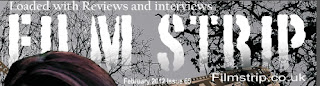
When creating my Film Magazine Front Cover I wanted to intertextualy link it to several other media products of the same type. One of the main forms and conventions of the magazine cover is the masthead. I tried to make my masthead bold and eye catching, but at the same time to give it some style to fit in with the magazine's special issue. I noticed that some film magazines change the font of their masthead depending on what is on the front cover. This is what i tried to do with my front cover. Other forms and conventions of magazine front covers include, puffs, plugs, main feature title, main photo, sub headings and bold colour schemes. In my front cover, the puff is above the masthead. Puffs are things like 'Best film magazine', which attract the audience and convince them to buy the magazine. The puff I used is 'Loaded with reviews and interviews'. I think it works very well because it attracts people who are interested in film reviews and reading about interviews with their favourite actors. Plugs are things like teasers, or things which intrgue the reader to turn the page. In my front cover, I put 'Prizes up for grabs' as the plug. Audiences like receiving free goodies and prizes from the magazines they read. Music magazines often do this by including free music CD's. The main cover photo is of the main actor, Zoe Hilton. I made the photo very large, so that the viewer can pick up on it easily. The title of the film 'Evil Awaits' is written in big bold letters on top of the main image. This is magazine's main article or main feature, which is what will attract the audience the most. Just like other film magazines, it was important that I made the main feature title bold and eye catching. Below the main title, is a short catchphrase, 'Face Your Fears'. This creates an imppresion amongst the audience that they will be fully immersed in the film when they watch it. The colour schemes also play a good part in the appearance of the front cover. The dark trees in the background help to create the horror atmosphere of the film. Below the main feature photo is timeline with snippets of the film trailer. This shows a preview of what is inside the magazine, which intrigues the reader.
To conclude this part of the evaluation, my media product has used form and conventions of real media products by reflecting the iconography of horror, the mise en scene, setting and sound. My media product is intertextualy linked to existing media products.
No comments:
Post a Comment